
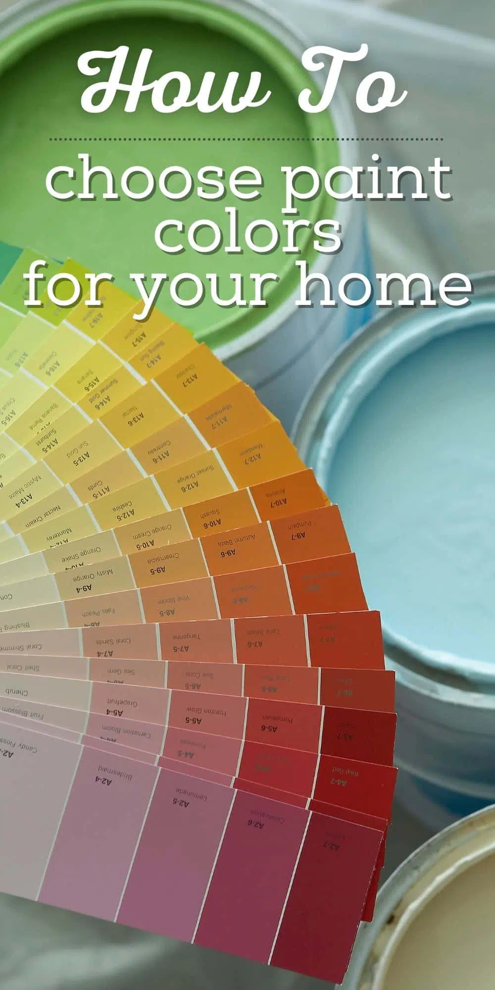
5 Tips on How to Choose Paint Colors for a Coastal Cottage Look
Feeling overwhelmed picking a paint color for your home? You’re not alone! Whether you’re aiming for a breezy beach vibe or a cozy coastal cottage, choosing a coastal paint color can feel like a big decision—but it doesn’t have to be stressful.
Here are my favorite tips and tricks to help you confidently pick colors you’ll love—and some of the most popular coastal cottage paint colors to get you started!
Why Picking a Paint Color Can Feel So Hard (and How to Make It Easier)
Picking a paint color is one of my favorite parts of a room transformation…
But it can also scare me silly! 😅
If you’ve ever stood frozen in the paint aisle wondering how in the world to choose the right shade of blue, you’re not alone. Choosing a color palette for your home’s interior can feel completely overwhelming.
Over the years—and several houses later—I’ve gathered some simple, tried-and-true tips that helped me confidently choose coastal cottage paint colors. These tips work for any room, whether you’re going for a beachy feel or simply want a calming, fresh palette.
5 Tips for Choosing Coastal Cottage Paint Colors
Here are some tips I’ve used that have helped guide me through the maze of choosing colors to fit that coastal cottage style.
1. Start with What You Love
Before you even look at a paint swatch, gather inspiration.
- Search Pinterest, magazines, and home design blogs.
- Save photos of rooms you’re drawn to.
- Pay attention to the overall feeling those rooms give you. Light, airy, peaceful?
Tip: Create a Pinterest board or folder on your phone to keep your ideas organized.

2. Look for Repeating Color Themes
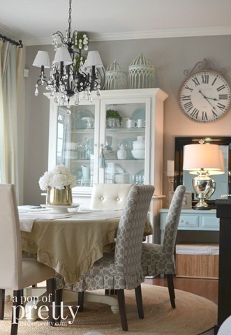
As you study your inspiration photos, certain colors will probably pop up again and again. For me, it was watery blues, seafoam greens, & whites.
These colors just felt right for me—calming, fresh, and timeless. Ask yourself what colors feel right for you?

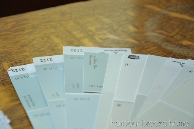
3. Dig Deeper into the Color Tones You Like
Let’s say you love blue. Awesome! But there are a million blues out there.
Watching old episodes of Sarah’s Cottage helped me narrow it down. The coastal kitchen she designed used a color called “gray” but it looked blue-green in the room. That’s when I realized how lighting and undertones matter.
Look closely at the paint names in rooms you admire. You might be surprised by what they’re actually called!
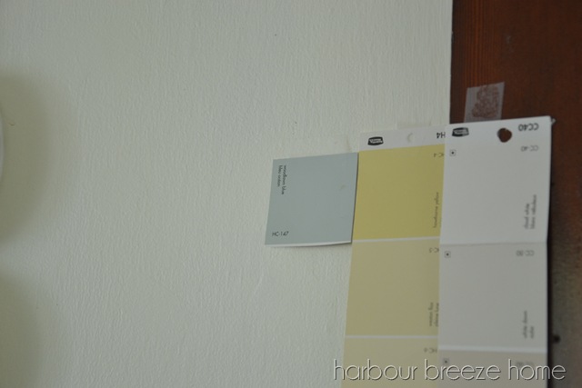
4. Test Paint Colors the Smart Way
This step is crucial! A paint color can look completely different on your wall than it does in a photo or on a tiny swatch.
Here are 3 smart ways to test paint colors:
- Paint poster boards with sample sizes and tape them to your wall. Move them around throughout the day to see how the light changes them.
- Paint swatches directly on your wall, but be aware that your current paint color might affect how they look.
- Use peel-and-stick samples (available online for popular brands like Benjamin Moore and Sherwin Williams).
5. Relax—It’s Just Paint!
Seriously. The best decorating advice I ever read was:
“It’s just paint.”
If you put it up and don’t love it, paint over it! Even the pros (like Sarah Richardson!) change their minds sometimes.
If you need a place to start for finding colour inspiration and learning more painting tips and tricks, check out Benjamin Moore’s website here.
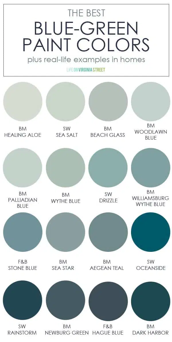
What are some of the most popular blue green paint colors for a coastal look?
Want to shortcut your search? Here are a few tried-and-true favorites that many coastal-style lovers swear by:
Blue-Green & Watery Tones:
- Benjamin Moore Palladian Blue
- Sherwin Williams Sea Salt
- Benjamin Moore Beach Glass
- Benjamin Moore Woodlawn Blue
- Sherwin Williams Rainwashed
Soft Neutrals & Whites:
- Benjamin Moore White Dove
- Benjamin Moore Simply White
- Sherwin Williams Alabaster
- Benjamin Moore Revere Pewter (a great greige with coastal vibes)
I’ve recently discovered a super helpful article by Life on Virginia street with a list of popular blue green paint colors, along with pictures of them in homes. You might find it super helpful.
We used sea salt in one of our previous bathroom, and I recognize others as some of my favorites as well.
If you are looking for muted, coastal paint colors, I suggest you google it. You’ll find a whole lot of inspiration to choose from!
Want more help in choosing the right paint?
- How to choose a paint color you’ll have no regrets about!
- What is the right paint sheen for what I’m doing?
- How to paint a room
- Interior painting supply checklist: What do I need to paint a room?
- Home decor tips and tricks from HGTV stars
- Resources to help choose paint colors
Curious What Colors We Chose?
See the whole house paint colors for our farmhouse by the sea!
For more fresh ideas for your home:
Be sure to join the VIP newsletter list! As a valued VIP member, you will get exclusive access to the entire library of free printables – including wall art, cards, organization lists, menu planning set, and more.
Click here or the button below to join today.

And if you want to see more real life behind the scenes action, be sure to come join me on my @harbourbreeze Instagram Channel!


Choosing paint colors can be scary. A few years ago we needed to paint all the rooms in our house. I looked at so many pictures of rooms. But it was helpful. I am pleased with all my choices. Last year I changed one bedroom to a nursery. That was so fun because it basically was for me. I was expecting 2 great grandbabies. They take occasional naps in there and get their diapers changed. My oldest grandson is the father of my great granddaughter. One day he told me that he really appreciated the nursery. It made it easier for them to visit. That’s why I did it!❤️
Rita this blog was so helpful! Even though I love decorating and color paint always trips me up! Your tips all helped me relax a bit and just go with my gut. And I too love Sarah Richardson!
I have noticed you don’t monetize your page, don’t waste your traffic,
you can earn extra bucks every month because you’ve got hi quality content.
If you want to know how to make extra bucks, search for: Boorfe’s tips best adsense alternative